Grace Living is a residential care facility for the elderly (RCFE) in Oxnard, California. I worked with my team to audit their online experience and redesign their information architecture. Using the design thinking method, we applied new IA patterns and site features based on thorough research with an eye toward accessibility and ease of use.
The client’s website was a bare-bones, informational website that used an outdated layout from the early years of the internet. They wanted us to focus on redesigning the site and adding functionality for current and future families, specifically to help facilitate family connection during the COVID-19 pandemic.
Our clients didn’t understand exactly what UX was or what we would be delivering. We walked them through the design thinking process and helped them understand how a good UX design would help both their business and their families. Additionally, we had to design in compliance with HIPAA regulations. And our clients used a CMS with no in-house or freelance software engineers, so we had to plan our designs around what they could implement themselves.
Being a small business in a community with only a few RCFEs, Grace Living’s main competition came from large retirement homes. We created a competitive analysis matrix covering five direct competitors and two indirect competitors to asses for target market, business values, web design, usability, information architecture, accessibility, and features. This exercise helped us facilitate a mini SWOT analysis, and provided us with a list of potential opportunities. These opportunities, however, came with challenges to overcome.
Opportunity #1
No other local competitors had online portals where families of residents could log in for at-a-glance, easily digestible information about the residents. This opportunity could establish a digital connection between family members.
Opportunity #2
No local RCFEs had the functionality on their websites to facilitate the automation of information updates, such as daily emails, activities, health updates, or any other relevant information about the resident. The client's intent was to grow their business and expand their facility. To grow, automation was necessary.
Opportunity #3
The client didn’t have any features on their website that shared information about the goings on at the facility. This seemed to be something our direct and indirect competitors focused on, and could help the local community get to know Grace Living and their values easily.
Challenge #1
The client didn't have a budget to bring in a developer to custom make the features we would suggest. We also didn't have a designated UI designer, nor would they hire one when we finished our UX process, so we had to coach them on how to implement a gray scale, UX-annotated wireframe into an aesthetically pleasing UI.
Challenge #2
With every design we made, challenge #1 naturally led us to brainstorm around the fact that we were the sole entity on this project. We had to rely on our knowledge of the client's CMS and its capability to produce what we designed through plug-ins.
Challenge #3
Not only did we not have the cross collaborative support of a product manager or development team, we only had four weeks to complete the entire redesign of the website.
We conducted eight interviews with current and past family members of Grace Living residents, as well as two SME interviews with hospice nurses and care facility staff members.
Even though the client wanted us to design features centered on connecting families, we had to determine if the families would even use these technologies if they were developed. Most residents are in their eighties and nineties. Most children of these residents are in their sixties and seventies, and everyone we spoke to talked about their limitations with technology.
We also determined, based on the age range of our target users, that a survey would be less helpful because we didn’t have enough time to distribute it. So we relied entirely on our interviews and the insights from our clients.
Insight #1
Target users still use technology every day, even though they expressed limitations.
Insight #2
Users want realistic depictions of happenings at the facility. They don't want the website to look like the facility is a five star resort or a cruise ship.
Insight #3
COVID-19 has massively impacted how families interact and communicate with their loved ones in residence.
Insight #4
Families appreciate constant communication from the facility.
Insight #5
Families want to know that their loved ones aren’t just watching TV all day.
Insight #6
Families want to know about health changes immediately.
Insight #7
The only way families received information from Grace Living was from email updates, and they wanted new ways of getting that info.
Using the data from our research, we created two user personas to empathize with our target user and better create solutions to the problems they were facing.


A journey map based on the current web experience helped us to better empathize with the users and understand how they were experiencing the Grace Living website.

From all of these research-based insights and empathy exercises, we pooled together our thoughts and came up with the following problem statement to help guide our designs:
The families of current Grace Living residents need a private space on their website that connects them with the heart and quality care that defines Grace Living. Showcasing true moments of connection and community will help families trust that their loved ones are being cared for.
We used the problem statement and design principles we came up with to create eight concepts we would present to the clients. Each designer contributed two ideas.
The two concepts I came up with were:
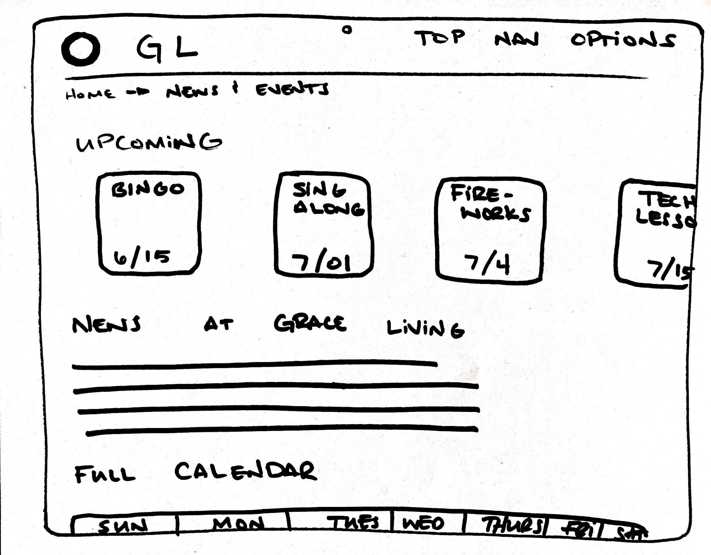
1) a news and events page that showed the happenings at Grace Living, and
2) an automated email system that would allow family members to be updated about very specific things according to their preferences, such as daily activities, meals, health changes, events, etc.
I took these two sketches (of the dozens that I had made) and turned them into wireframes.


We tested these eight concepts with eight users. Based on what we learned from these tests, we came together as a team to develop the most viable concepts, and adapt them to better meet the needs of the users.
Once we had determined what features to build, my role as the information architect was to remap the website. We'd determined as a team what to include from our concepts, as well as content that was already on the existing site that the clients deemed necessary, and the following map resulted from that.

Given the time constraints of the project, we didn't have time to deliver a high-fidelity prototype. We worked with a gray-scale style guide that matched our concept wireframes to deliver a mid-fidelity prototype.
We conducted usability tests with eight users, who successfully accessed the profile and found information about their loved one’s schedule. However, we discovered several areas where we could improve the design—most notably that users had a very difficult time finding any information about Grace Living’s COVID-19 response, which indicated that we needed a better location for finding that information. We created a FAB for it in the top nav.
We iterated on our designs based on the user feedback before compiling our work for delivery. We took care to detail how the client could use our designs to work with their CMS, creating both annotated and mobile-adaptive wireframes.
We compiled a list of future recommendations to implement, which included several of the concepts we didn’t build out—like the resident log and automated email feature showcased above. In the four week time limit we had on the project, we were able to deliver a minimum viable product that gets our clients where they need to be, and provides a way forward for them to offer continual and added value to their families.
Learning #1
I'm a firm believer in equal opportunity. Being on a project that made me think about how someone different from myself would access and use a product was an integral part of my journey as a UX designer. It's imperative that we not only apply accessible principles for products meant for those who need them, but also to incorporate them in everything we make.
Learning #2
Given the constraints of both the client and the time frame, we had to work around the inability to apply custom designs in both UI and development. UX philosophy is imperative, but sometimes I think we talk about it as if it's more important that the programming or UI. Without those things, the product doesn't exist.
Learning #3
Above, I say that we came up with eight concepts for the project, and each team member developed two. What I should say is that, as a team, we brainstormed dozens of ideas. Before landing on the eight that we actually concepted, we threw away at least eight more. I learned the importance of getting an idea on paper and then being willing to toss it aside if it doesn't work.
Learning #4
I listened to what the users expected and desired from this product and didn't focus only on what I wanted them to see. Because of that I was able to develop a product that speaks to their needs.
Our research insights and opportunities really defined how we created our design artifacts and problem statement, which helped us successfully identify what users were lacking and guided our solution to the problem. Both the client and usability testers found the solutions we provided to be effective and expressed excitement in them. The newly designed IA coupled with the new features will greatly enhance the user experience on the Grace Living website.